Visualizing various types of data
Lecture 4
Dr. Elijah Meyer + Konnie Huang
Duke University
STA 199 - Fall 2022
September 8, 2022
Checklist
– Go to the course GitHub org and find your ae-03-penguins (repo name will be suffixed with your GitHub name).
– Clone the repo in your container, open the Quarto document in the repo
– Reach out if you have questions
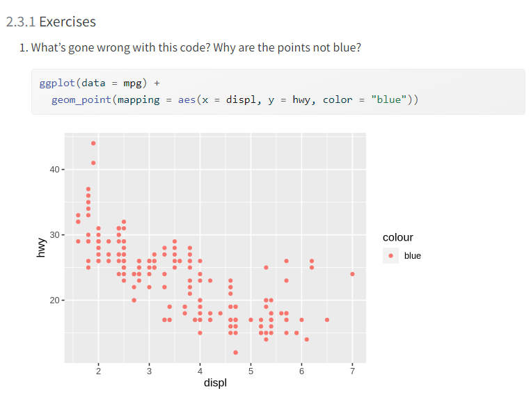
Warm up: Exercises 2.3.1

Questions from Chp 4 - Exploring categorical data / Chp 5 - Exploring numerical data
https://app.sli.do/event/mX7kxXxd49tL4VS9iwCa2T
How to turn AE’s via Github
– render, commit, and push
If you made any changes since the last render, render again to get the final version of the AE.
Check the box next to each document in the Git tab (this is called “staging” the changes). Commit the changes you made using an simple and informative message.
Use the green arrow to push your changes to your repo on GitHub.
Check your repo on GitHub and see the updated files. Once your updated files are in your repo on GitHub, you’re good to go!
The variables dictate the plot
– Assess the relationship between height and weight
– Investigate the distribution of scores on exam 1
– Explore 2022 temperatures between Montana and North Carolina
– Examine if drinking coffee or not impacts the amount of sleep you get (above recommended, at recommended, below recommended)
The variables dictate the plot
Assess the relationship between height and weight - geom_point()
Investigate the distribution of scores on exam 1 - geom_histogram() / geom_boxplot
Explore 2022 temperatures between Montana and North Carolina - geom_histogram / geom_boxplot (with changes in the aes!)
Examine if drinking coffee or not impacts the amount of sleep you get (above recommended, at recommended, below recommended) - geom_bar (with changes in the aes!)
geom reference
https://ggplot2.tidyverse.org/reference/
A geom is the geometrical object that a plot uses to represent data. People often describe plots by the type of geom that the plot uses. For example, bar charts use bar geoms, line charts use line geoms, boxplots use boxplot geoms, and so on. Scatterplots break the trend; they use the point geom. As we see above, you can use different geoms to plot the same data.
Application exercise
ae-03
Go to the course GitHub org and find your
ae-03(repo name will be suffixed with your GitHub name).Clone the repo in your container, open the Quarto document in the repo, and follow along and complete the exercises.
Render, commit, and push your edits by the AE deadline – 3 days from today.
Recap of AE
Pick geoms based on data types.
Set appropriate binwidths for histograms.
Turn off legends when they provide redundant information with
show.legend = FALSE.Take control of your labels
Use color to your advantage. https://ggplot2.tidyverse.org/reference/ggtheme.html & https://ggplot2.tidyverse.org/reference/scale_viridis.html
