HW 3 - Ethics + recap- Suggested Answers
This homework is due Friday, Oct 14 at 11:59pm ET.
Homeworks are to be turned in individually as usual (different from labs)
Getting started
Go to the sta199-f22-2 organization on GitHub. Click on the repo with the prefix
hw-03. It contains the starter documents you need to complete the homework assignment.Clone the repo and start a new project in RStudio. See the Lab 0 instructions for details on cloning a repo and starting a new R project.
Workflow + formatting
Make sure to
- Update author name on your document.
- Label all code chunks informatively and concisely.
- Follow the Tidyverse style guide.
- Make at least 3 commits.
- Resize figures where needed, avoid tiny or huge plots.
- Use informative labels for plot axes, titles, etc.
- Turn in an organized, well formatted document.
Packages
We’ll use the tidyverse package for much of the data wrangling and visualization, though you’re welcomed to also load other packages as needed.
Exercises
Exercises 1 and 2 are review exercises based on common questions that came up during the exam.
Exercise 1
All about Quarto:
-
For each of the character strings below, determine if the string is an proper code chunk label to use in a document when rendering to PDF. If not, explain why. You’re welcomed to try them out to check.
- Chunk 1:
#| label: label with spaces- Chunk 2:
#| label: reaaaaaaaaaalllllllllyyyyy-long-label #| with-line-breaks- Chunk 3:
#| label: 1-label-starting-with-number- Chunk 4:
#| label: label-with-dashes
Suggested Answer A code-chunk label with spaces, line breaks, and numbers that start the label are inappropriate and will cause an error when trying to render your document to a PDF. A label with dashes is appropriate and suggested in place of spaces.
-
What values does each of the following chunk options take and what do they do?
evalerrorwarningecho
Suggested Answer
eval - Takes True or False. This controls whether a code chunk runs when rendering a document.
error - Takes True or False. When set to false, prevents messages that are generated by code from appearing in the finished file.
warning - Takes True or False. When set to false, prevents warnings that are generated by code from appearing in the finished.
echo - Takes True or False. When set to false, prevents code, but not the results from appearing in the finished file.
- What do the chunk options
fig-heightandfig-widthdo – what do they do when they’re set in a single code chunk and what do they do when they’re set in the document YAML on top?
Suggested Answer
fig-height and fig-width change the height and width of an embedded figure in your rendered file within the code-chunk these arguments are given. When this is contained in the YAML, it changes the height and width of all figures in the document.
Exercise 2
All about group_by():
Suppose we have the following tiny data frame:
# A tibble: 5 × 3
      x y     z
  <int> <chr> <chr>
1     1 a     K
2     2 b     K
3     3 a     L
4     4 a     L
5     5 b     K
a. What does the following code chunk do? Run it and analyze the result and articulate in words what group_by() does.
df |>
  group_by(y)
Suggested Answer
The argument group_by takes df and converts it into a grouped data frame where future operations are performed “by group” (a or b).
b. What does the following code chunk do? Run it and analyze the result and articulate in words what arrange() does. Also comment on how it’s different from the group_by() in part (a)?
df |>
  arrange(y)
Suggested Answer
arrange orders the rows of df by the values of of y. It defaults to arrange the rows based on ordering the y column alpha-numerically.
c. What does the following code chunk do? Run it and analyze the result and articulate in words what the pipeline does.
Suggested Answer
The following code chunk converts it into a grouped data frame, then the mean of the values of x are calculated for each group determined by y.
d. What does the following code chunk do? Run it and analyze the result and articulate in words what the pipeline does. Then, comment on what the message says.
Suggested Answer
The following code chunk converts df into a grouped data frame by both the values of y and the values of z. Then the mean of the values of x are calculated for each group determined by the combinations of y and z. The message summarise() has grouped output by ‘y’. You can override using the .groups argument is a reminder that we have grouped data and suggestes that the dplyr package (installed when we install tidyverse) drops the last group variable before making the calculations. However, the message does not have an impact on the final result, and can be viewed as a friendly reminder that our data are grouped.
e. What does the following code chunk do? Run it and analyze the result and articulate in words what the pipeline does. How is the output different from the one in part (d).
Suggested Answers
This code converts our data frame into a grouped data frame by the unique combinations of y and z. Then, the mean is calculated for each unique combination. The output is now different then part d, because our resulting data frame is no longer grouped by any variables thanks to the .groups = "drop" argument.
f. What do the following pipelines do? Run both and analyze their results and articulate in words what each pipeline does. How are the outputs of the two pipelines different?
Suggested Answers
The first code chunk converts df into a grouped data frame by both the values of y and the values of z. Then the mean of the values of x are calculated for each group determined by the combinations of y
The second code chunk creates a new variable called mean_x and adds it as a column to the existing data frame df. Five means are calculated, one for each row of our original data frame df. The means calculated are still by the grouped unique combinations of y and z.
Render, commit (with a descriptive and concise commit message), and push. Make sure that you commit and push all changed documents and your Git pane is completely empty before proceeding.
Exercise 3
The following chart was shared by @GraphCrimes on Twitter on September 3, 2022.
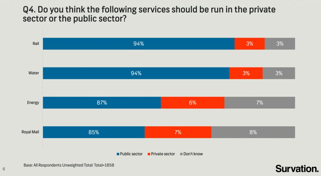
- What is misleading about this graph?
*Suggested Answer**
This graph is misleading because the width of the bars are not the same across groups, despite displaying the same value. Additionally, the widths within sector are not to scale, making it seem that the difference between public, private, and don’t know are closer than the data would suggest.
- Suppose you wanted to recreate this plot, with improvements to avoid its misleading pitfalls from part (a). You would obviously need the data from the survey in order to be able to do that. How many observations would this data have? How many variables (at least) should it have, and what should those variables be?
Suggested Answer
The total sample size is 1858 (from the caption of the plot). Additionally, we would need two variables to recreate the plot. These variables should be a services variable and sector variable.
- Load the data for this survey from
data/survation.csv. Confirm that the data match the percentages from the visualization. That is, calculate the percentages of public sector, private sector, don’t know for each of the services and check that they match the percentages from the plot.
survation <- read_csv("data/survation.csv")Rows: 1858 Columns: 5
── Column specification ────────────────────────────────────────────────────────
Delimiter: ","
chr (4): Royal Mail, Energy, Water, Rail
dbl (1): ID
ℹ Use `spec()` to retrieve the full column specification for this data.
ℹ Specify the column types or set `show_col_types = FALSE` to quiet this message.survation_longer <- survation |>
pivot_longer(
cols = -ID,
names_to = "service",
values_to = "sector"
)
survation_longer |>
count(service, sector) |>
group_by(service) |>
mutate(prop = n / sum(n))# A tibble: 12 × 4
# Groups: service [4]
service sector n prop
<chr> <chr> <int> <dbl>
1 Energy Don't know 130 0.0700
2 Energy Private sector 112 0.0603
3 Energy Public sector 1616 0.870
4 Rail Don't know 56 0.0301
5 Rail Private sector 56 0.0301
6 Rail Public sector 1746 0.940
7 Royal Mail Don't know 149 0.0802
8 Royal Mail Private sector 130 0.0700
9 Royal Mail Public sector 1579 0.850
10 Water Don't know 56 0.0301
11 Water Private sector 56 0.0301
12 Water Public sector 1746 0.940 survation_longer |>
mutate(
service = fct_relevel(service, "Royal Mail", "Energy", "Water", "Rail"),
sector = fct_rev(fct_relevel(sector, "Public sector", "Private sector", "Don't know"))
) |>
group_by(service, sector) |>
summarise(cnt = n()) |>
mutate(freq = round(cnt / sum(cnt), 3))`summarise()` has grouped output by 'service'. You can override using the
`.groups` argument.# A tibble: 12 × 4
# Groups: service [4]
service sector cnt freq
<fct> <fct> <int> <dbl>
1 Royal Mail Don't know 149 0.08
2 Royal Mail Private sector 130 0.07
3 Royal Mail Public sector 1579 0.85
4 Energy Don't know 130 0.07
5 Energy Private sector 112 0.06
6 Energy Public sector 1616 0.87
7 Water Don't know 56 0.03
8 Water Private sector 56 0.03
9 Water Public sector 1746 0.94
10 Rail Don't know 56 0.03
11 Rail Private sector 56 0.03
12 Rail Public sector 1746 0.94- Recreate the visualization, and improve it. You only need to submit the improved version, not a recreation of the misleading graph exactly. Does the improved visualization look different than the original? Does it send a different message at a first glance?
# A tibble: 12 × 4
# Groups:   service [4]
   service    sector             n   prop
   <chr>      <chr>          <int>  <dbl>
 1 Energy     Don't know       130 0.0700
 2 Energy     Private sector   112 0.0603
 3 Energy     Public sector   1616 0.870
 4 Rail       Don't know        56 0.0301
 5 Rail       Private sector    56 0.0301
 6 Rail       Public sector   1746 0.940
 7 Royal Mail Don't know       149 0.0802
 8 Royal Mail Private sector   130 0.0700
 9 Royal Mail Public sector   1579 0.850
10 Water      Don't know        56 0.0301
11 Water      Private sector    56 0.0301
12 Water Public sector 1746 0.940 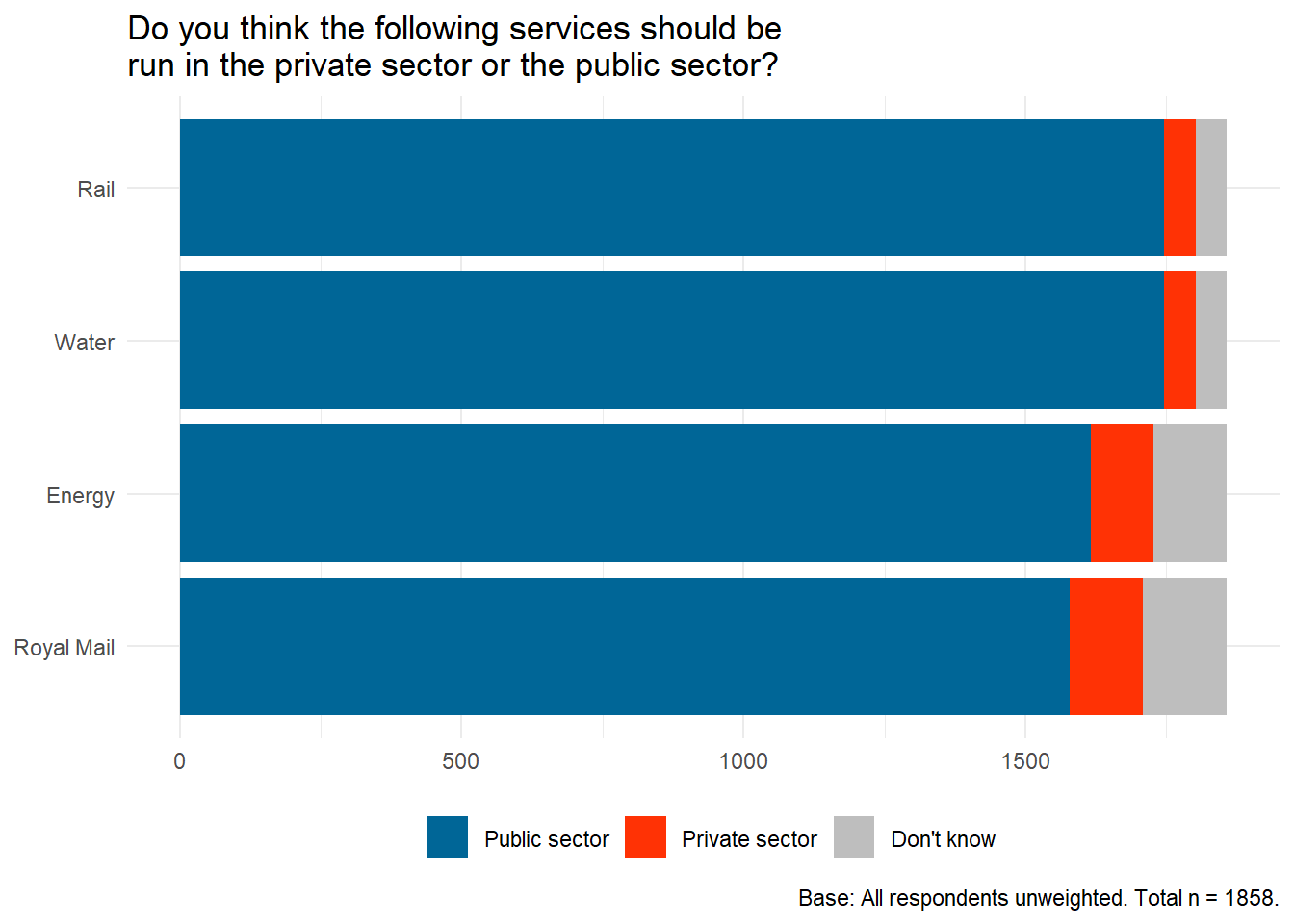
Suggested Answer
Yes, the improved visualization sends a much different message. Now, at first glance, it is more obvious that, regardless of service, most individuals voted that they should be handled in the public sector instead of the private or don’t know. Before, the differences within sector were less obvious due to poor scaling.
Exercise 4
A data scientist compiled data from several public sources (voter registration, political contributions, tax records) that were used to predict sexual orientation of individuals in a community. What ethical considerations arise that should guide use of such data sets?1
Suggested Answers
AWV - Ethical considerations include if individuals can be re-identified through the use of these data; If using these data are a breach of reasonable privacy; if the intent is harmful when analyzing these data.
Once again, render, commit, and push. Make sure that you commit and push all changed documents and your Git pane is completely empty before proceeding.
Exercise 5
A data analyst received permission to post a data set that was scraped from a social media site. The full data set included name, screen name, email address, geographic location, IP (internet protocol) address, demographic profiles, and preferences for relationships. Why might it be problematic to post a deidentified form of this data set where name and email address were removed?2
Suggested Answers
Yes. Screen name, email address, address, and geographic information all can be used to re-identify individuals within these data (see OKCupid example).
Exercise 6
To complete this exercise you will first need to watch the documentary Coded Bias. To do so, you either need to be on the Duke network or connected to the Duke VPN. Then go to https://find.library.duke.edu/catalog/DUKE009834953 and click on “View Online”. Once you watch the video, write a one paragraph reflection highlighting at least one thing that you already knew about (from the course prep materials) and at least one thing you learned from the movie as well as any other aspects of the documentary that you found interesting / enlightening.
AWV
Render, commit, and push one last time. Make sure that you commit and push all changed documents and your Git pane is completely empty before proceeding.
Wrap up
Submission
- Go to http://www.gradescope.com and click Log in in the top right corner.
- Click School Credentials Duke Net ID and log in using your Net ID credentials.
- Click on your STA 199 course.
- Click on the assignment, and you’ll be prompted to submit it.
- Mark all the pages associated with exercise. All the pages of your homework should be associated with at least one question (i.e., should be “checked”). If you do not do this, you will be subject to lose points on the assignment.
- Select the first page of your PDF submission to be associated with the “Workflow & formatting” question.
Grading
- Exercise 1: 10 points
- Exercise 2: 10 points
- Exercise 3: 10 points
- Exercise 4: 3 points
- Exercise 5: 3 points
- Exercise 6: 10 points
- Workflow + formatting: 4 points
- Total: 50 points
Footnotes
This exercise is from MDSR, Chp 8.↩︎
This exercise is from MDSR, Chp 8.↩︎