AE 09: Data Ethics
In September 2019, YouGov survey asked 1,639 GB adults the following question:
In hindsight, do you think Britain was right/wrong to vote to leave EU?
- Right to leave
- Wrong to leave
- Don’t know
The data from the survey is in data/brexit.csv.
brexit <- read_csv("data/brexit.csv")In this application exercise we tell different stories with the same data.
Exercise 1 - Free scales
Create a segmented bar plot facet by region to explore counts of votes to the question Was Britain right/wrong to leave EU.
Next, use scales = "free_x" as an argument to the facet_wrap() function. How does the visualisation change? How is the story this visualisation telling different than the story the original plot tells?
ggplot(brexit, aes(y = opinion, fill = opinion)) +
  geom_bar() +
    facet_wrap(~region,
    nrow = 1, labeller = label_wrap_gen(width = 12),
    scales = "free_x"
  ) +
  guides(fill = "none") +
  labs(
    title = "Was Britain right/wrong to vote to leave EU?",
    subtitle = "YouGov Survey Results, 2-3 September 2019",
    caption = "Source: bit.ly/2lCJZVg",
    x = NULL, y = NULL
  ) +
  scale_fill_manual(values = c(
    "Wrong" = "#ef8a62",
    "Right" = "#67a9cf",
    "Don't know" = "gray"
  )) +
  theme_minimal()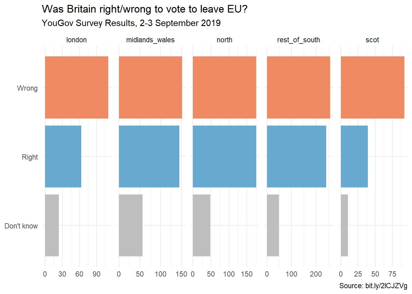
Answer Here
The visualization changes, as the x-axis changes based on the sample size within each facet. It visually is harder to see what is going on, and it appears to suggest, for example, London’s “Wrong” votes are similar to North, despite having drastically different sample sizes.
Exercise 2 - Comparing proportions across facets
First, calculate the proportion of wrong, right, and don’t know answers in each category and then plot these proportions (rather than the counts) and then improve axis labeling. How is the story this visualisation telling different than the story the original plot tells? Hint: You’ll need the scales package to improve axis labeling.
brexit |>
  group_by(region, opinion) |>
  summarize(n = n()) |>
  mutate(freq = n / sum(n)) |>
  ggplot() +
  geom_bar(aes(y = opinion, x = freq, fill = opinion), stat = "identity") +
  facet_wrap(~ region, nrow = 1) +
  scale_x_continuous(limits = c(0,1)) +
  theme_bw() +
  labs(
    title = "Was Britain right/wrong to vote to leave EU?",
    subtitle = "YouGov Survey Results, 2-3 September 2019",
    caption = "Source: bit.ly/2lCJZVg",
    y = NULL, x = "Proportion"
  ) +
    scale_fill_manual(values = c(
    "Wrong" = "#ef8a62",
    "Right" = "#67a9cf",
    "Don't know" = "gray"
  ))
`summarise()` has grouped output by 'region'. You can override using the
`.groups` argument.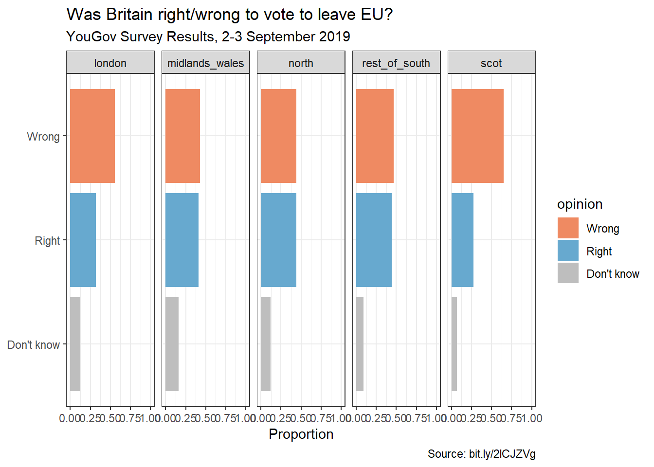
Answer Here
The x-axis is now proportions.
Exercise 3 - Comparing proportions across bars
Recreate the same visualisation from the previous exercise, this time dodging the bars for opinion proportions for each region, rather than faceting by region and then improve the legend. How is the story this visualisation telling different than the story the previous plot tells?
brexit |>
  group_by(region, opinion) |>
  summarize(n = n()) |>
  mutate(freq = n / sum(n)) |>
  ggplot() +
  geom_bar(
    aes(y = opinion, x = freq, fill = region),
    position = "dodge", stat = "identity"
  ) +
  scale_x_continuous(limits = c(0,1)) +
  theme_bw() +
  labs(
    title = "Was Britain right/wrong to vote to leave EU?",
    subtitle = "YouGov Survey Results, 2-3 September 2019",
    caption = "Source: bit.ly/2lCJZVg",
    y = NULL, x = "Proportion",
    fill = "Region"
  )
`summarise()` has grouped output by 'region'. You can override using the
`.groups` argument.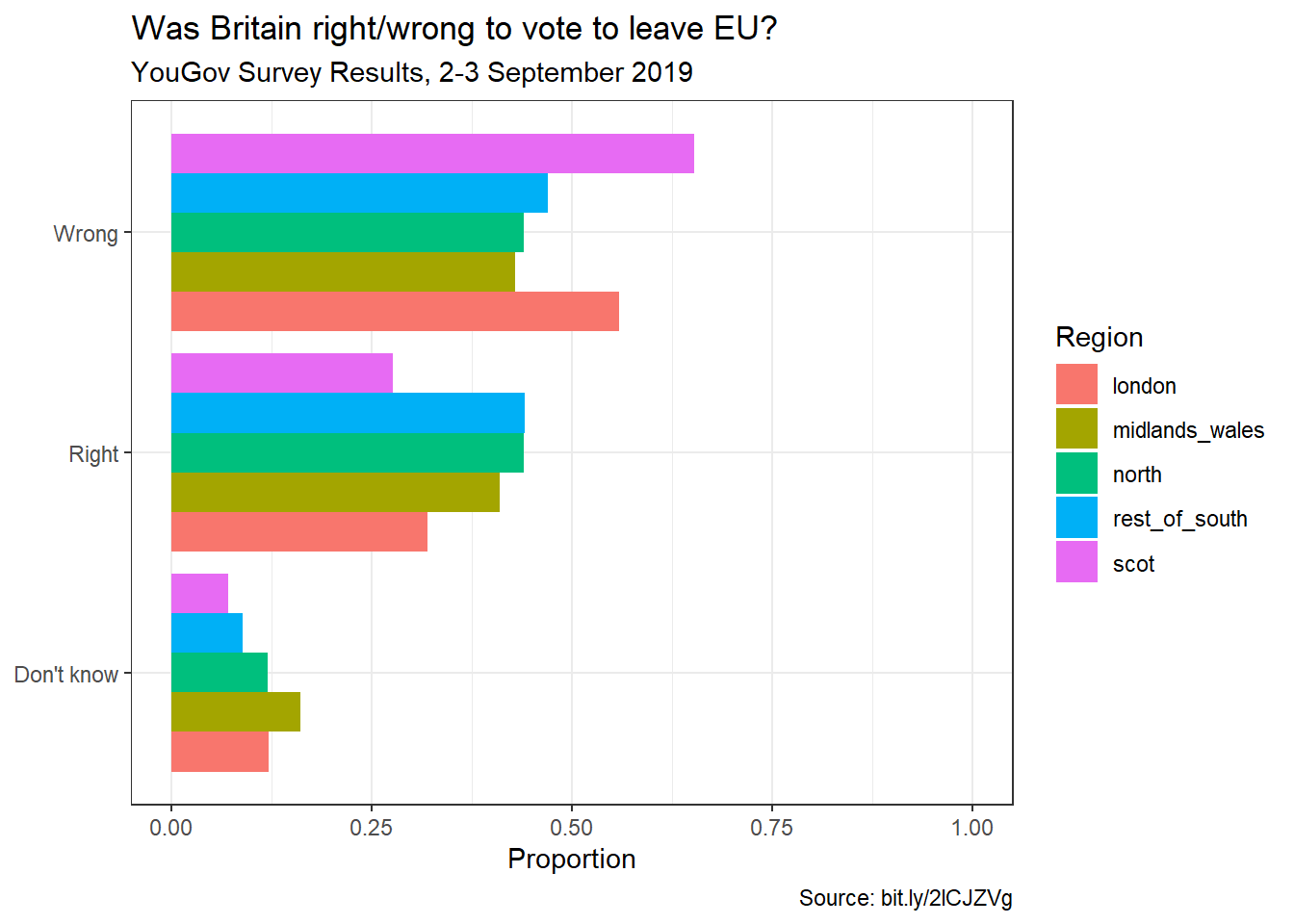
Answer Here
This visualization tells the story of within opinion vs within region like the others.